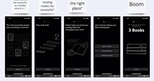
The Secret to Better Onboarding? More A-Ha Moments
How to create moments that make users think, ‘This is exactly what I need.’
Unlocking A-ha moments in onboarding
Ever clicked on something and instantly thought, Yes, this is exactly what I need? That’s what I call an a-ha moment. And since we're talking about (web) onboardings here, if your onboarding isn’t creating these moments early, you’re losing users before they even get started.
Some a-ha moments hit like lightning bolts. Others are quiet nods of recognition. Whether it’s an OMG! or a simple ‘mhm,’ these moments are when users realize: this product gets me.
But here’s the kicker - if you’re waiting until onboarding to create that moment, you’ve already lost a chunk of users. It happens way earlier. In the ad, in the messaging, in the first screen they see. That’s where curiosity turns into commitment.
Where A-ha moments happen
A-ha moments aren’t a single spark. They build over time, often across multiple screens, until the user sees the value clearly. Here’s where they show up:
In the ad: The first touchpoint should immediately click with the right audience. If they don’t see themselves in the messaging, they won’t engage (e.g. the ad showing different types of belly fat - the user goes 'aha, this is my belly right here').
On the first screen: Set expectations fast. Reinforce why they clicked and show them they’re in the right place (e.g. the screen asking 'how much weight do you want to lose' and the user not only things 'mhm, I do want to lose some weight' but also sees reasonable weight loss numbers on that screen).
In the onboarding flow: Guide them towards a quick win. Whether it’s a personalized result or a simple action that shows progress, they need to feel the value early (e.g. a BMI calculation showing them where they'll land on the BMI chart after they reach their target weight).
On the paywall: Show users what transformation they’re paying for. The moment they think this is exactly what I need, they’re ready to commit (give them a graph, a timeline, something to remind them why losing weight is important to them - you already asked this on onboarding, didn't you? Didn't you?).
Inside the product: The best onboarding makes the product itself feel intuitive. A-ha moments should confirm they made the right choice ('now that you're in, this is what you need to do to lose xx kg by May, let's do it').
So how to create a-ha moments
Some products hit users with an a-ha moment in seconds. Others take more time. But the best ones always leverage a mix of:
1. Calculations, graphs, and loaders
People love seeing their own data in action. A calculator estimating savings, a progress graph, or even a well-timed loader can create that click moment. Loaders, despite being ‘delays,’ often make users feel the system is working* for them - *a trick even AI relies on. I've seen a funnel start with a loader once O_o. Oh, and if you're not having those interrupting pop-ups on your loader, what are you even doing?
2. Wording that speaks their language
It’s not just about what’s written; it’s about making users feel understood. An ADHD app should avoid overwhelming screens. A financial tracker should focus on clear takeaways. An app for younger people would be totally fine with emojis and a more playful UI. When users see messaging that resonates, trust builds fast.
3. Visuals that bring value to life
Sometimes, seeing is believing. A virtual try-on feature, a personalized meal plan, or an AI-generated avatar—all of these create instant clarity. When users can see the product working for them, engagement follows.
Making onboarding an a-ha moment
Some apps manage to make the entire onboarding experience an a-ha moment. Instead of telling users what they do, they show them.
For example:
A photo-organizing app that lets users swipe through and delete duplicates immediately, rather than explaining how it works.
A singing app that first records a user struggling with notes, then guides them to improvement in real time.
However complex of a product, have an onboarding that doesn’t overwhelm users with features. Instead, focus on solving one problem at a time. Users come in looking for a specific solution—onboarding should deliver on that, then guide them to explore more over time.
Get the a-ha moment collection
If you’re looking for inspiration, or examples to what I just told you about, I’ve put together a free collection of 100+ onboarding screens that drive engagement and make users go, Wow, this is perfect for me! Each one comes with expert insights on what makes it work.
📌 Want it? Refer someone to this newsletter or connect with me on LinkedIn and I’ll send it to you.
Until next time, happy onboarding!


